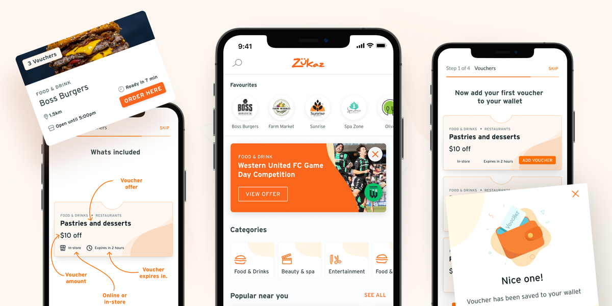
An effective onboard strategy for a thrifty AR app.

Client
Zukaz
Project Timeline
3 month partnership
Company Stage
Established start-up
Process Used
UX Update
Deliverables
The Project
Zukaz were crushing it in regional Victoria. Their AR app attracted customers by helping merchants use foot traffic in a whole new way. They had a unique approach to finding vouchers, but they failed to educate users on how get started. Their app needed an onboarding process so their users could benefit from it.
Zukaz WebsiteProblems we discovered
01 Onboarding absent
First-time users had no indication of how their new app worked.
02 Benefits unclear
The app's best features were going unnoticed, and users were being left unmotivated.
03 Opportunities missed
Zukaz's freemium model failed to retain any important user info. This meant future research would suffer.
Who we designed for

Young Social Butterfly
An enthusiastic explorer that loves living local. They've got their finger on the pulse when it comes to new stores and entertainment.

01 We overhauled onboarding and implemented a scenario-based tutorial.
The app’s original onboarding process was minimal at best. It wasn’t helping anyone. Workshop and sprint sessions helped us uncover which areas users needed education in. By employing a scenario-based tutorial mode, we saw a decrease in user confusion and an increase in goal achievement.


“Alyoop has been a pleasure to work with. Their ability to not only make things look great but also understanding where product problems lie,
and what our users’ problems are, is what
sets them apart”

03 We enhanced market research by capturing consensual user data.
Freemium apps aren’t good at capturing vital user data. We leveraged the onboarding process we developed for Zukaz so that new users can provide useful information to the client, even if they don’t return to the app. This data can enhance future audience targeting and user retention, and the method we employed is one way to beat a common risk of freemium models.

