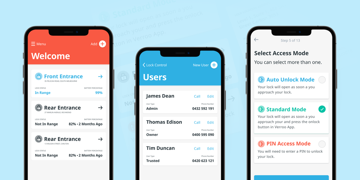
High tech smart locks with a delightful user experience

Client
Ross Locks
Project Timeline
2 month partnership
Company Stage
Company 2 years
Process Used
UX Update, UI Design
Deliverables
The project
Coming from one of Australia's longest standing and respected lock manufacturers, Verroo's smart lock only allows users to access the lock through Bluetooth, creating a much more secure system than similar locks that rely on wi-fi. Multiple users, multiple features, one hell of a secure lock.
View in App StoreProblems we uncovered
01 Designing within the limitations of Bluetooth and the physical product.
Making complicated lock terminology, and Bluetooth technology easy for users to understand and enjoy.
02 Creating an immersive and interactive user experience.
Designing an intuitive and unique expereince for lock owners to feel secure at home.
03 Creating a design system for future growth.
Creating a comprehensive Design System for iOS for the internal team to continually add features and product updates well into the future.
04 Technical jargon was hard to understand
Through user testing, we uncovered that language was an issue and prevented users from understanding how to perform tasks.
Who we designed for

Locksmith
A locksmith that can increase their client base by offering a new product and/or being able to install the locks for new clients.

Homeowner
A tech-savvy and security-conscious individual that wants to be progressive by having their house secured thoroughly without relying on a physical key again.

01 Designing software for hardware
With a fully digital product, there is absolute flexibility for us designers. But as soon as some hardware is introduced, we need to be careful to only design a user experience that compliments the physical device itself. For this particular project, it was important that we considered the user journey as a whole, including how this was affected by the physical location and workings of the lock itself and worked closely with the product owner before we even pulled together a wireframe.

02 A functional and minimal user interface
Verroo's smart lock needed to feel secure, but it also needed to be intuitive and approachable. The UI design looked to compliment rather than complicate the project. This meant removing any elements that could be a distraction and, based on user testing, even opting for simple text instruction over graphic depictions in some instances.


03 Communicating complex information in simple language
With applications like Verroo, every word counts. Instructional sentences in the onboarding process are just as important as the words chosen for buttons. As well as serving this functional purpose, the copy speaks the language and tone of the brand. A direct and reliable tone did the job, polished and refined with a little more user testing.

04 Designing the UI to look of the times and more branded
A dated website always creeps up, and for BTCM, they were overdue for a redesign. After having their brand redesigned (which they nailed), their website needed to follow. With a fresh and impressive new look and feel, we created a marketing website design system to keep everything consistent and help scale and inform the product design system.

