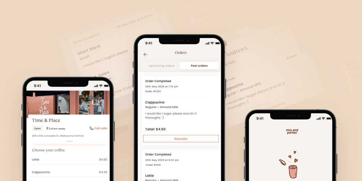
A sensible, streamlined app for sustainable cafe culture.

Client
Noa and Parker
Project Timeline
8 week partnership
Company Stage
Early stage start-up
Process Used
UX Update, UI Refresh
Deliverables
The Project
Noa and Parker signed over 10 cafes in their first 6 months, which validated their idea. With a more robust client base, they needed an app that catered to cafe owners and their customers. With heaps of features available, our testing process discovered which were essential, and which could come later. Result? One streamlined app.
Problems we discovered
01 Onboarding absent
Users were thrown in the deep end of a confusing process. They needed a clear-cut tutorial.
02 Confusing process
The most popular part of the app was the most difficult. The steps needed simplifying.
03 Unconsidered UI
N&P's UI felt like an afterthought.
We needed to give it some fresh, branded style.
Who we designed for

Café Workers
Baristas, waiters, chefs, and managers who know how their POS works and can't be bothered learning a tricky new system.

Regular Coffee Drinkers
Caffeine enthusiasts who love their daily dose. Reusable coffee cup owners who would happily use a more sustainable product, so long as it doesn't slow down their order.

01 We built a tutorial-based onboarding process that educated new users.
Our product audit identified the need for a user onboarding process. This would solve most of Noa and Parker’s high-level problems. We created a tutorial that clarified the client’s cup-loaning/coffee-ordering system, and the tutorial's flow-through was validated with testing by future users.


02 We redesigned the app’s most popular process to better suit all users.
Loaning cups was the most popular part of the app, and that was for café owners and customers. Unfortunately, we discovered that both sets of users were confused by the process. After we simplified the way cup-loaning was carried out, our objective validation process found that over 86% of users could nail the task with no issues.


"The team at Alyoop are great to work with. They helped take my initial product concept to the next level with a clear understanding of our brand's new direction. Their product design also solved a number of issues we hadn't considered within budget and timeline.
Highly recommend!"


03 We assessed the client’s new brand and made sure their UI matched.
Noa and Parker had just been through a rebrand, so we designed an app to match. The unique, practical UI minimises errors and confusion, while the stylised, elegant look pairs with the rustic coffee culture that the app is built to improve.

