Keeping plants well watered, basically saving the world one garden at a time
Client
Hydrawise
Project Timeline
6 month Partnership
Company Stage
Startup 2 years
Process Used
Product Redesign
Deliverables
The project
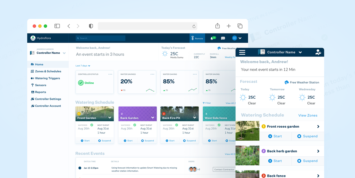
Hydrawise combines hardware and software that allows users to schedule their watering system simply and remotely, saving money and reducing waste. They've dominated the market as the best WiFi irrigation system and they came to us for help giving their hybrid application a modern UX and UI overhaul.
Problems we discovered
01 Onboarding didn't give enough information and direction
Users onboarding the app were left with little information and instructions on how to set up their controller.
02 Contractors didn't have a hub to manage their business
There was no centralised area for a contractor to manage their clients day-to-day
03 Editing settings was too complex
Settings lived under layers of other settings and were hard to find.
04 Dated visuals
The visual language was unintuitive and needed some sprucing up
Who we designed for
Contractor
A site manager/team leader with 20+ employees, that wants to decrease their man-hours and stress to impress their customers and keep current clients happy.

Labourer
An irrigation or landscape contractor that wants to please their managers and customers to secure more work.
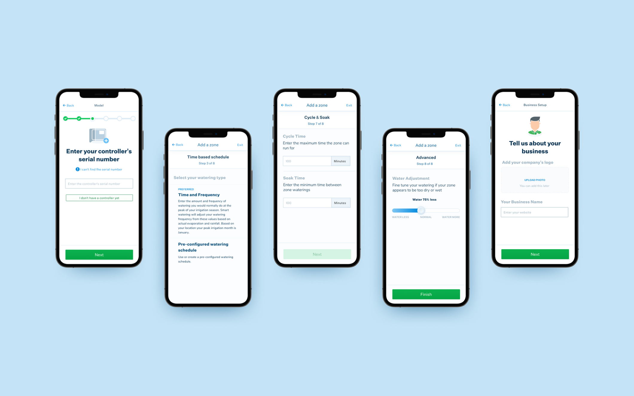
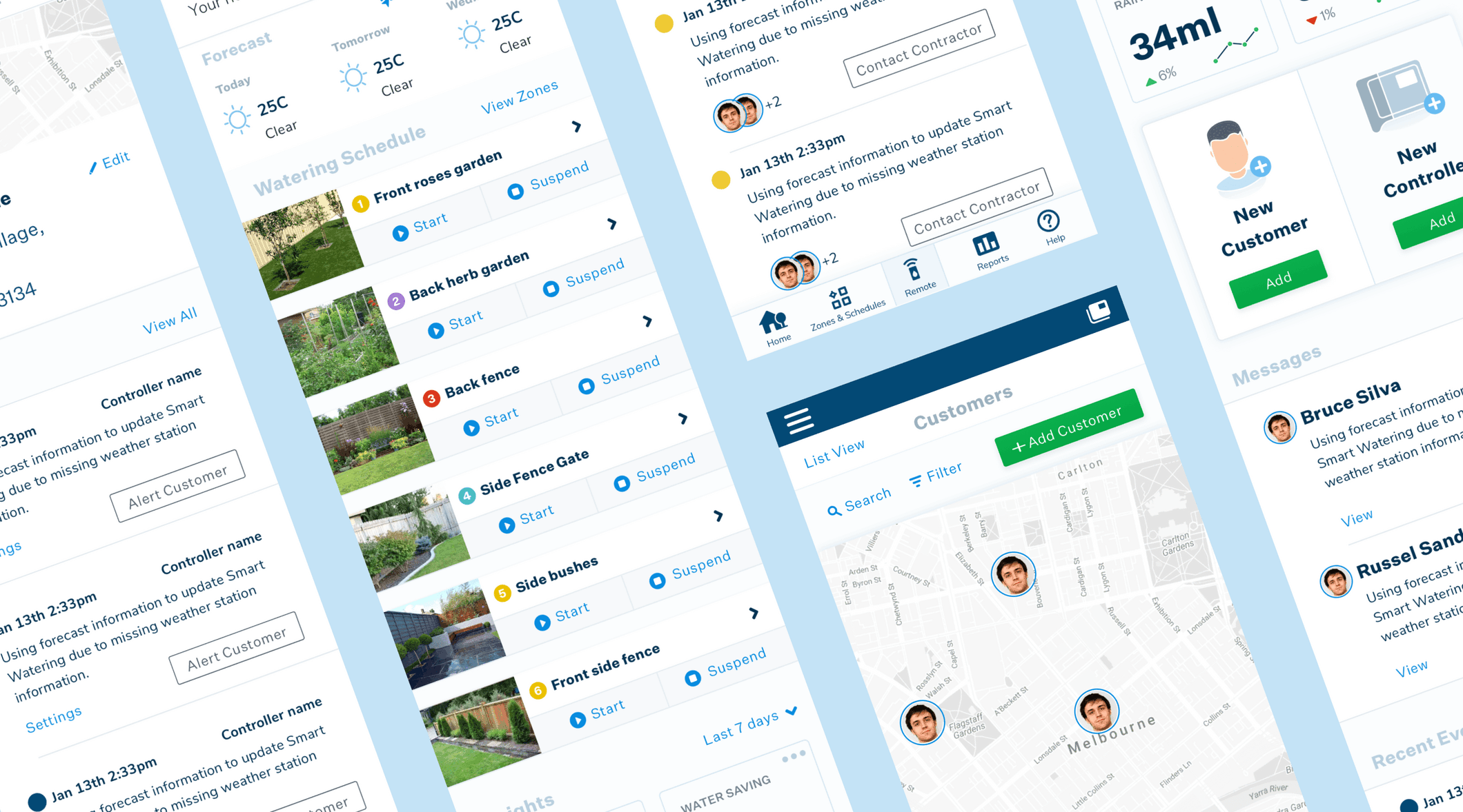
01 Designing an informative onboarding process
Our testing showed that Homeowner users were struggling to understand the terminology and industry lingo. As well as making copy recommendations, we designed informational clusters, meaning the user can focus on one piece of information at a time.
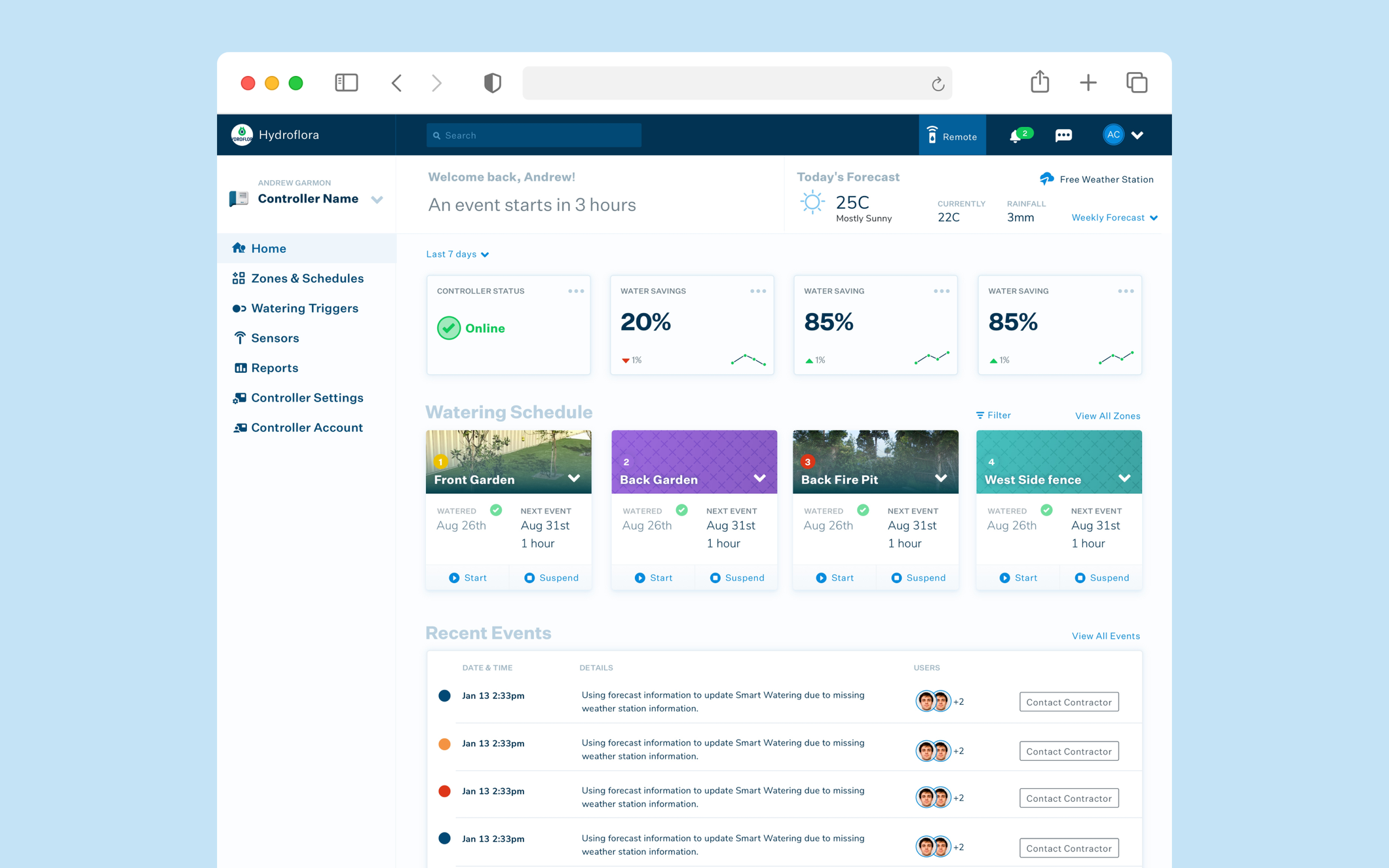
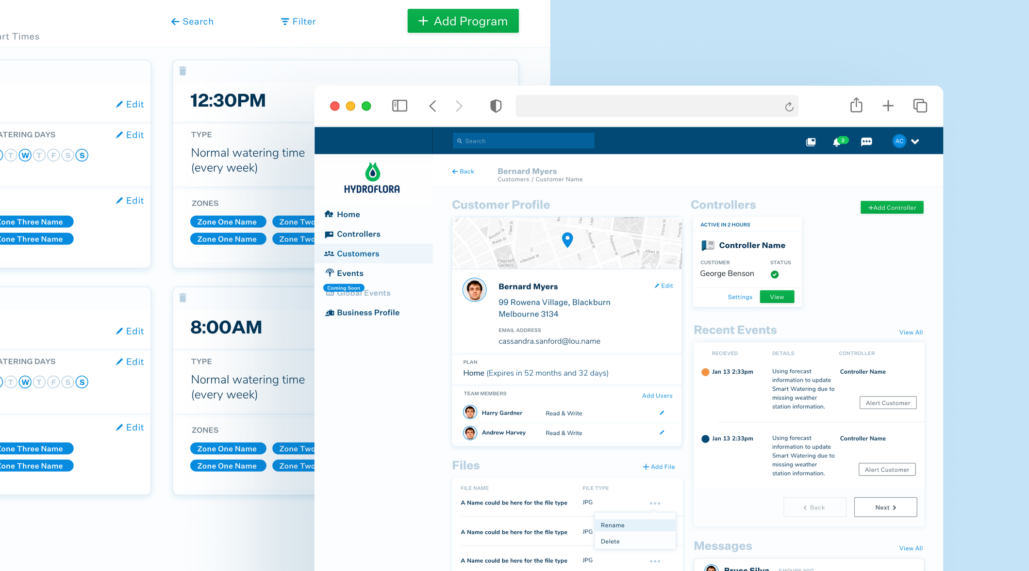
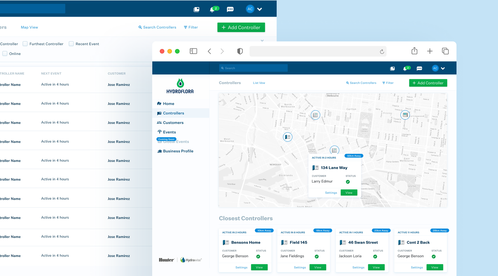
02 Contractor management system
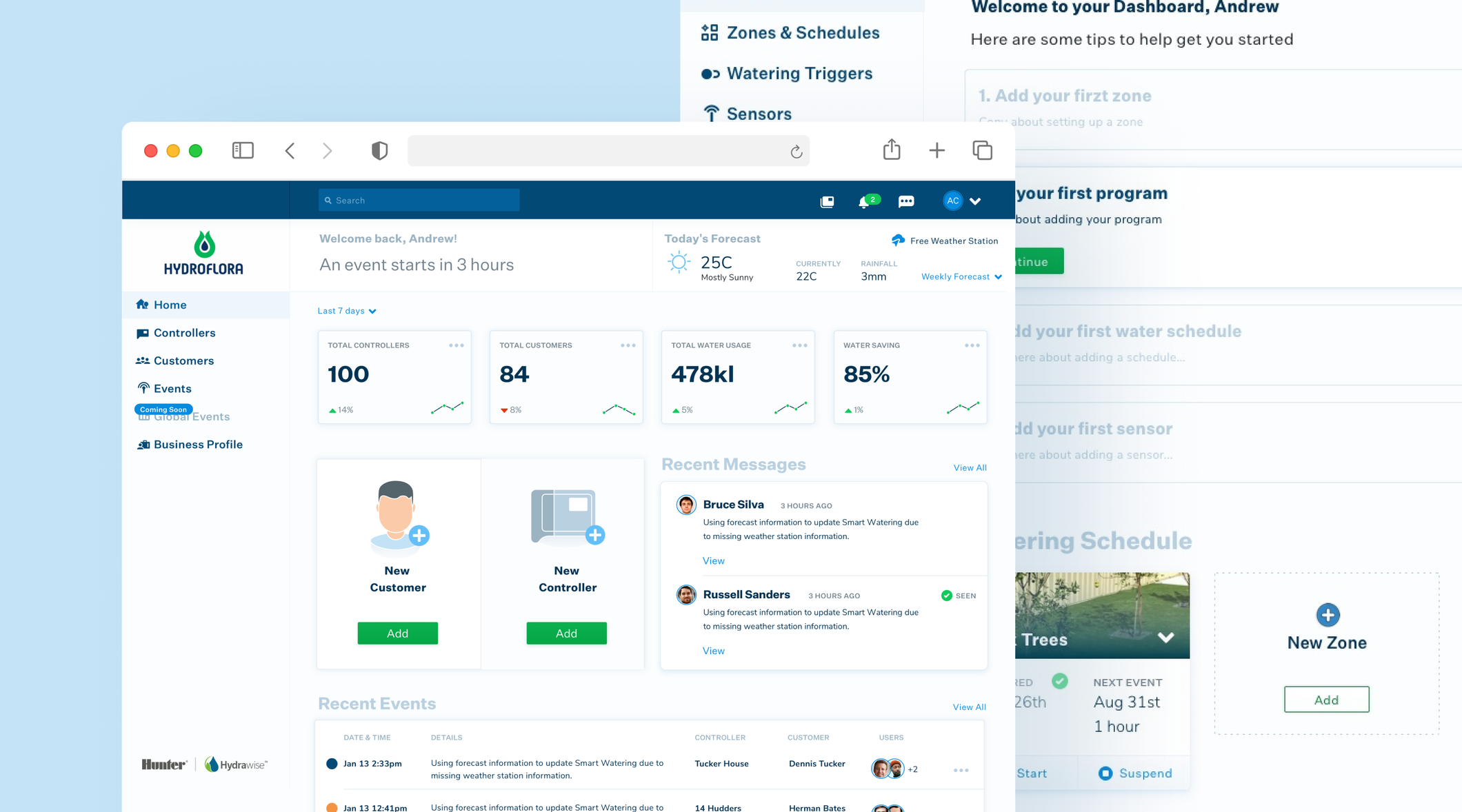
Landscaping contractors were a huge market for Hydrawise, each contractor using the application to service dozens of clients for their businesses. We designed a simple and identifiable way for Contractors to switch between a tailored Contractor and Customer dashboard so they could easily manage their business remotely.
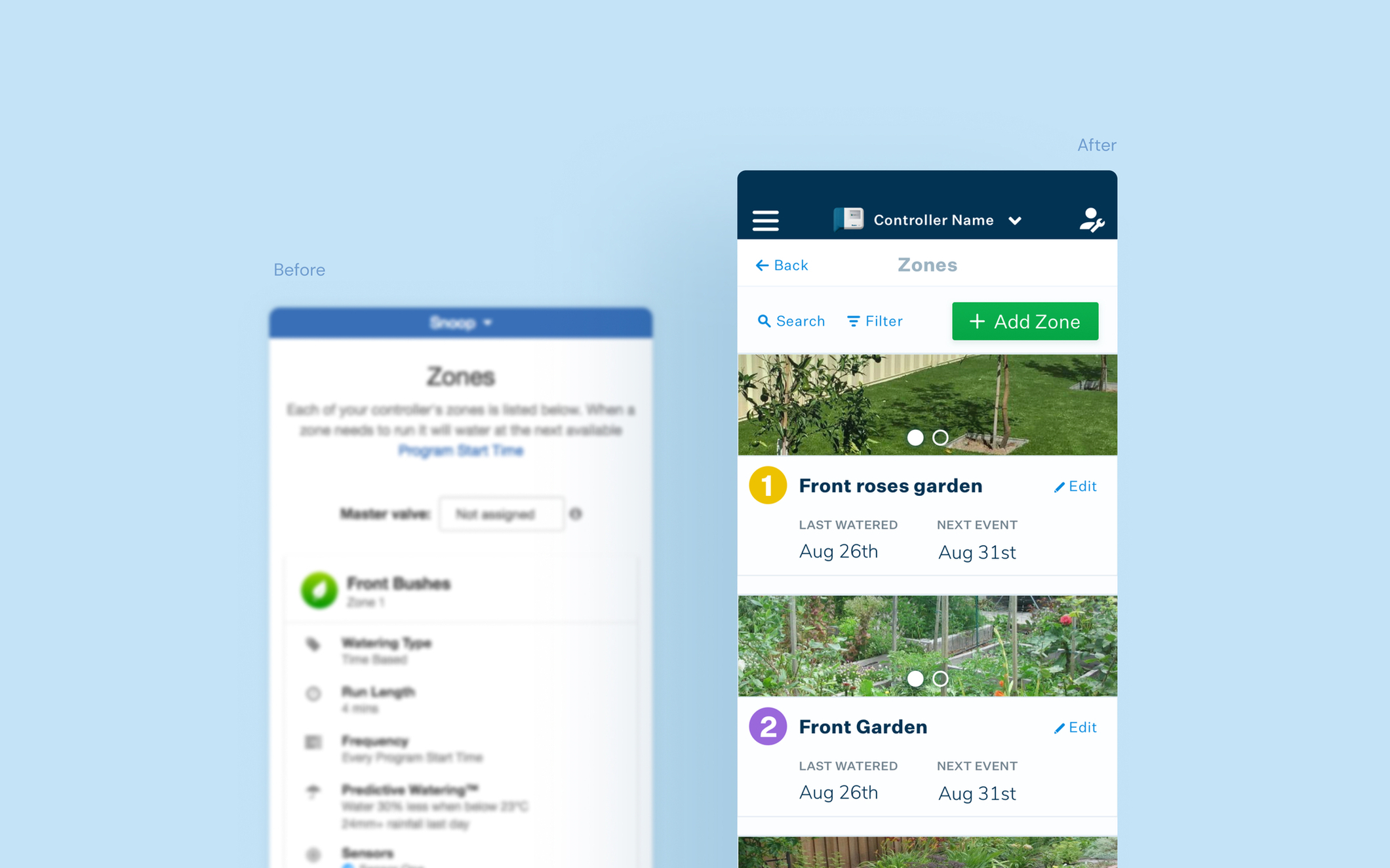
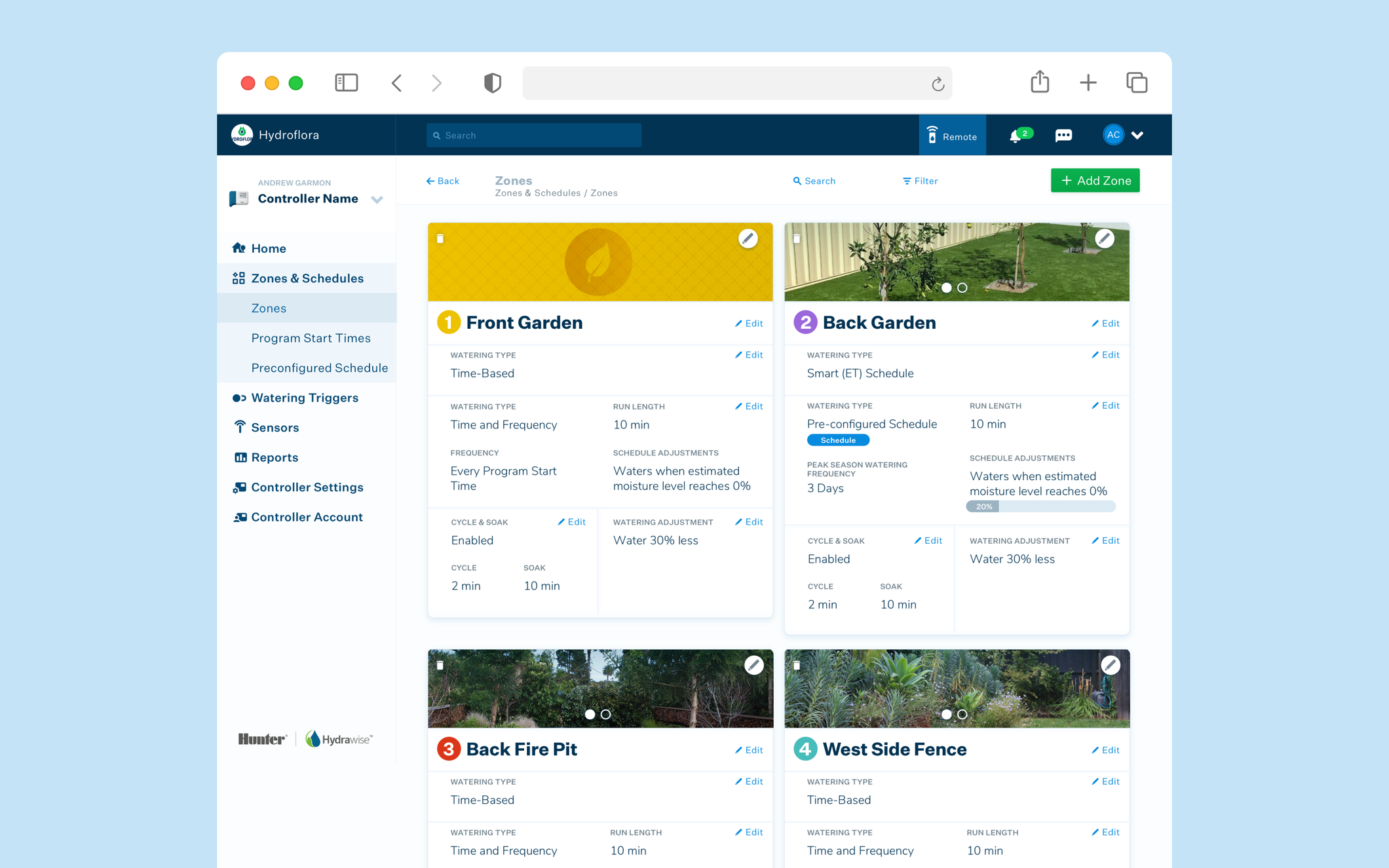
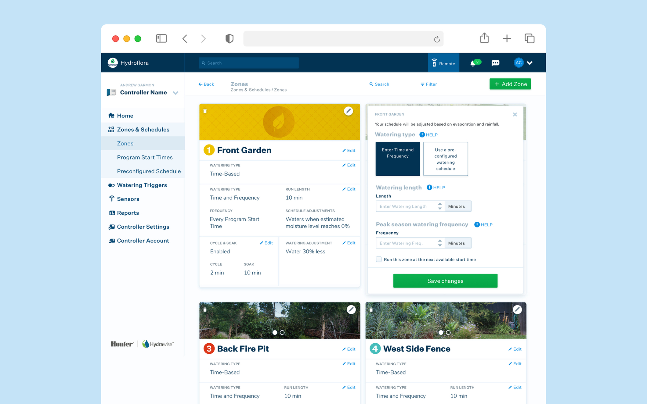
03 Easier editing of settings
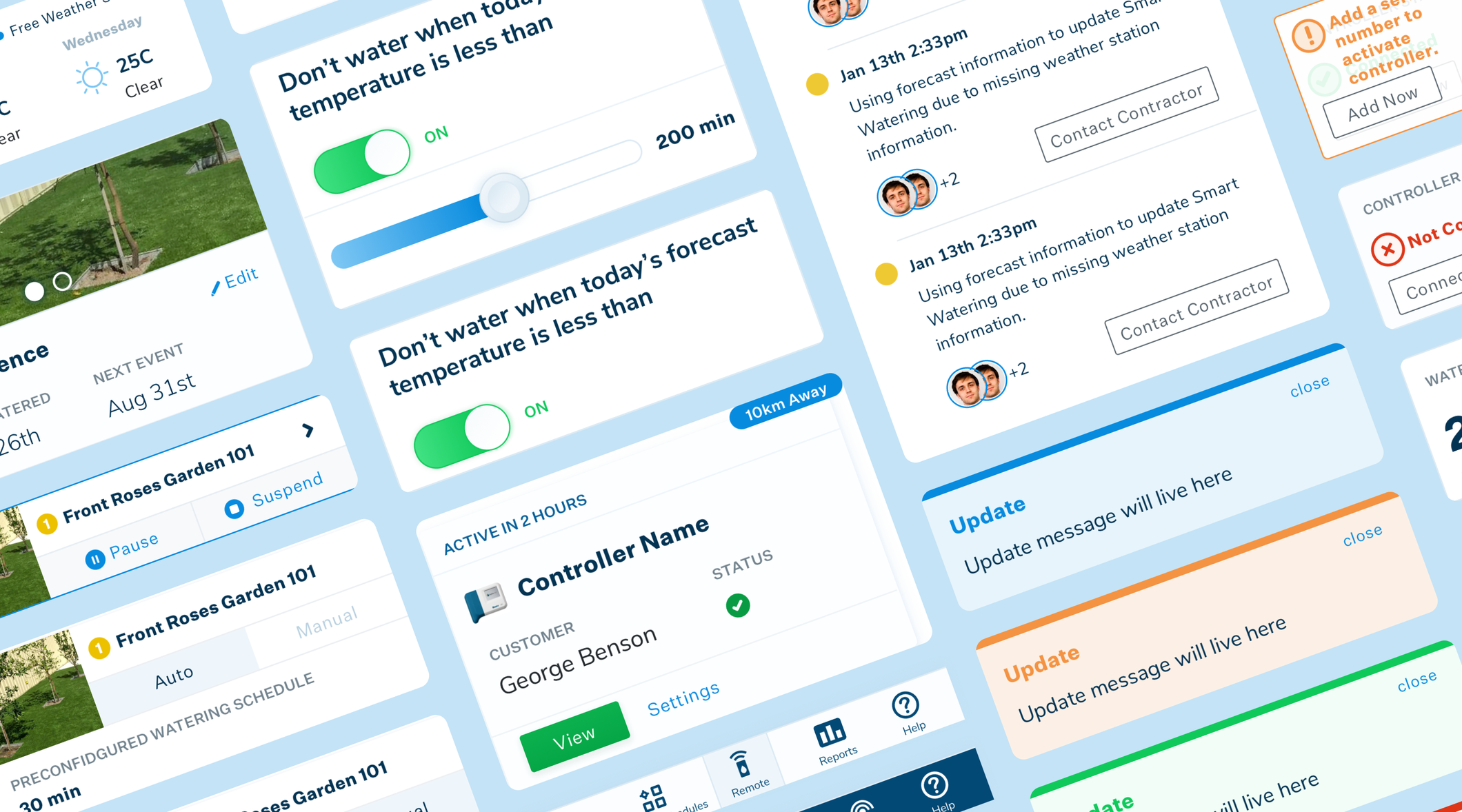
Usability showed that while Hydrawise has a lot of flexibility in its settings, the huge amount of options was leading to users feeling confused and overwhelmed. By displaying fewer options and breaking up screens into visually discernible sections, we helped users to focus on the settings that matter to them.

"Alyoop helped find simple design solutions to complex userflows and features on our hybrid desktop and mobile app. Their methodical and collaborative approach took both our users and developers into account, resulting in an intuitive and modern design"
04 Enhancing visual language
The visual language needed a refresh with bolder fonts and splashes of colour to convey importance, motion or action. This helped to direct users and increase functionality.
05 Design system
Creating a design system for an app makes it simple for future development and also allows the app to scale with consistent designs. Framing the UI components to change and move with the app helps developers to tweak and allows future designers to edit components.
