Helping users find better storage solutions
Client
Wilson Storage
Project Timeline
3 months
Company Stage
Mature
Process Used
Redesign Process
Deliverables
The project
In partnership with Metronome, Wilson Storage sought to enhance lead generation and quote inquiries for their storage units. We redesigned the user journey to simplify interactions with storage unit sizes, making it easy for users to determine the exact size they need and request a quote. This also streamlined Wilson Storage's lead management and conversion process.
Problems we uncovered
01 Lead Capture Deficiency
The website lacked effective methods to capture leads from users who did not want an immediate quote.
02 Localisation Issues
The units displayed did not align with users' preferred locations, affecting user satisfaction.
03 Mobile Optimisation
The existing website was not optimised for mobile devices, despite increased mobile usage.
Who we designed for

Residential Downgrader
A homeowner transitioning to a smaller living space, requiring additional storage to accommodate their new lifestyle needs.

Commercial Grower
A business owner experiencing growth, seeking secure and safe storage solutions for their products and inventory.
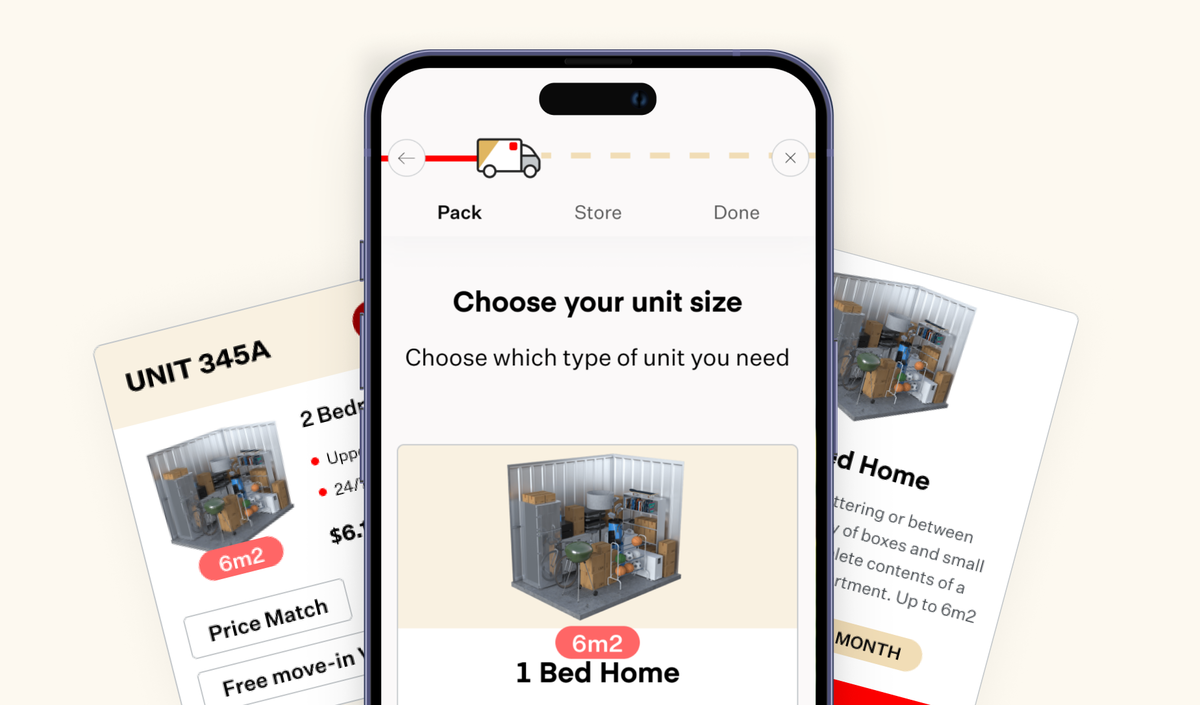
01 A secure Net to Convert Potential into Actual
Identifying a gap in the initial quote journey, we noticed the lack of understanding of the types of units users wanted and their preferred locations. By customising sections within the journey, we created clear pathways to determine user needs and collect essential details at the right stages. This ensured users were not deterred and felt confident to proceed with a quote, enhancing lead capture and conversion rates.


02 Creating a Community Feel with Localised Searches
By localising the search and displaying only available units in users' preferred locations, we fostered a sense of community as users progressed through their journey.


03 Familiar Charts, quick data
Consistent with our mobile-first approach, we ensured the step-by-step journey was optimised for mobile before considering the desktop experience. Utilising familiar gestures like scrolling and sliding, we created a seamless and intuitive navigation that guided users effortlessly through the process, enhancing their experience and reducing any potential frustration.


