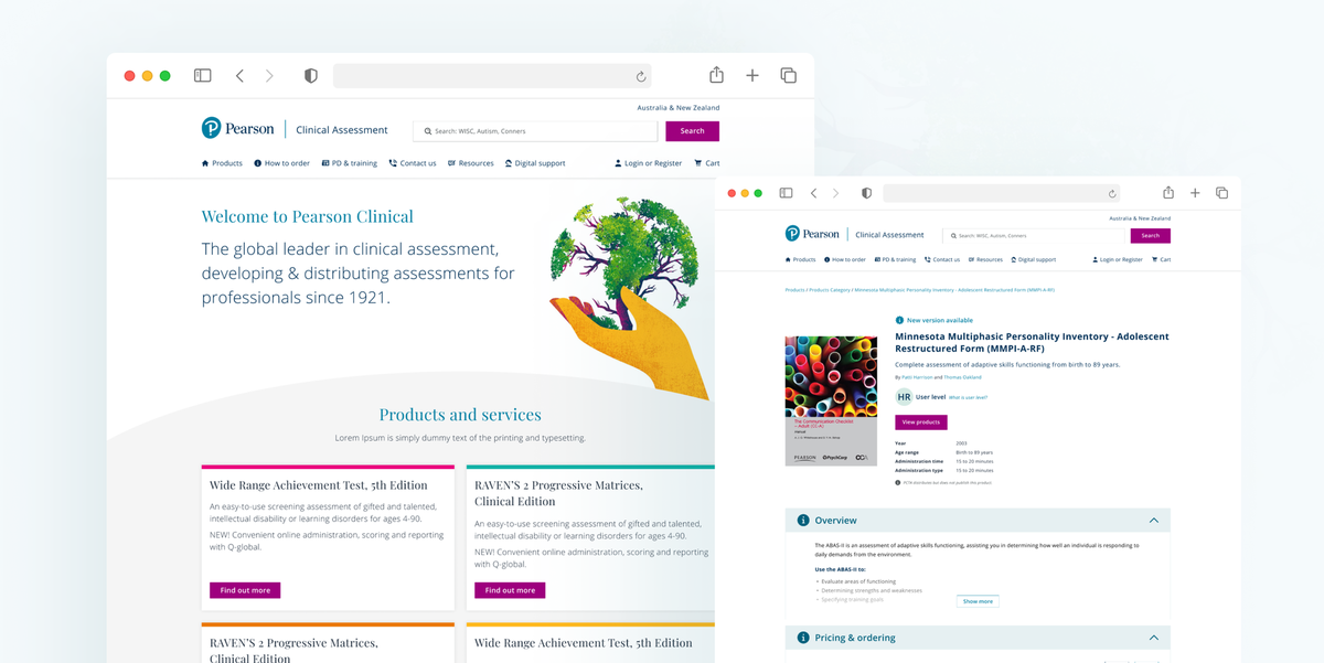
Helping spread professional knowledge through smart eCommerce

Client
Pearson Publishing
Project Timeline
6 week partnership
Company Stage
Established
Process Used
UX Update, UI Refresh
Deliverables
Project Description
Pearson Clinical is one of the world’s largest commercial distributors of psychological testing materials. Their website was confusing users and putting a huge workload on customer support. A redesign helped to make the site more intuitive, increase sales, and reduce the amount of befuddled customers calling the support line.
Pearson Clinical websiteProblems we discovered
01 Difficult way to see types of available products
Discovery times for users to find a specific book took too long. Churning the support team too often.
02 No simple navigation or filtering
Navigation and filtering were a struggle and created headaches for already time-poor users.
03 Finding an item and making a purchase was not intuitive
Users were struggling to search for their item and that was intensified when adding that item to the cart.
Who we designed for

Licensed Practitioner
A clinical professional who had limited time to search and find appropriate material.

01 Catering for a vast range of product types
With different packages, hard and soft copies, and a whole string of version histories for many of the titles, the choices were overwhelming. It was difficult for a user to find the right product and feel confident to move through the purchase process. Clear signposting and hierarchy helped to direct the user's eye, helping them to make the right choices and navigate to the products they were looking for.


02 Simplifying the navigation and filtering search results
Clean navigation using familiar design principles helped users to easily navigate the site. Adding an easy-to-use filtering system allowed users to refine their search results, allows their search to be a lot more targeted and helping to reduce the need to scroll or click through to other pages. Less time searching means fewer drop-offs and more sales.


“Professional and collaborative. Took the time to understand our objectives and managed our expectations well from start to finish. They also took the limitations of our platforms into consideration when designing the new UX flow, and yet the proposed UI still reflects best practice. Various business areas have used their service for multiple projects and everyone’s been pleased with the quality of work they’ve delivered.”
03 Refreshing the user interface
The user interface needed to be brought up to speed with Pearson's global brand guidelines. A design system was created to maintain consistency and help keep the development process smooth and quick. A clean user interface allowed the content and products to take centre stage.
