Helping travel buffs see more of the world for less

Client
Jack's Flight Club
Project Timeline
3 month partnership
Company Stage
Established Start-Up
Process Used
Full Redesign
Deliverables
Project Description
Jack's Flight Club is a community of people looking for one thing: cheap flights. Members sign up and get daily emails of travel deals. JFC needed a web app portal to host all these deals so members can see it all in one place. Founders Phil and Jack have been working with us for years as they continue to develop the mail outs along with a web and mobile app. As of February 2020, Jack's Flight Club had 1.5 million subscribers.
JFC's websiteProblems we discovered
01 Finding deals were too difficult to discover
Users were going through too many hoops to find a deal that would make them happy.
02 Fragmented and difficult onboarding process.
Even tho it was a quick onboarding it felt fragmented and not informative.
03 Lack of visual personaility
JFC had a unique brand but it wasn't shining through all over their product.
Who we designed for

Travel Buff
A world seeker that is looking for their next adventure without the cumbersome hassle of searching for cheaper deals.

01 Making travel info highly discoverable and consumable
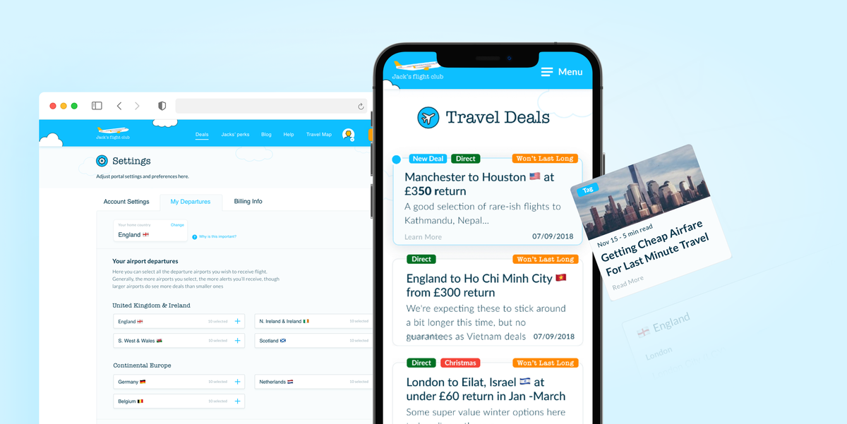
Creating a one-stop-shop to view all the travel deals allowed members to sign in at any time rather than wait for an email appear in their inbox. Search and filter features were tailored to suit optimal user journeys while a segregated information architecture kept all the juicy deal content in one area, and the unrelated brand and content in another.


02 Creating a seamless onboarding experience
At JFC, premium members get premium perks. These include narrowing down deals to those coming from your local airport, which means the system needs some extra info from you. A simple and intuitive onboarding process helped users to get as much value as possible out of the product without having to tinker too long in their settings.


"Alyoop helped find simple design solutions to complex userflows and features on our hybrid desktop and mobile app. Their methodical and collaborative approach took both our users and developers into account, resulting in an intuitive and modern design. Very adaptive and would listen to any feedback and always quick to respond. Highly recommend working with them!"


03 Designing a visual style
JFC is all about a friendly and inclusive approach. Users want to feel like they are part of the inner circle, getting some hot tips from someone they know and trust. To convey this in the visual style of the product, we drew influence from popular one-to-one messaging platforms like a good old mobile text message and built on this to create an intimate and direct user interface.
